Winter Olympics Branding
To design a winter olympic theme in Denver, Colorado. Denver is the capital of Colorado and home to some of the tallest mountains where people can go skiing and snowboarding. Denver also has some very popular places to visit from ski resorts,Red Rocks, and their sports stadiums. The city has been growing more and more every day, and would be a perfect location to host The Olympics of 2022.
Denver’s culture of art and nature co exist in what Denver is all about. It’s no surprise that Colorado’s outdoor life is what the cultures foundation was based off. Between hiking, snowboarding, skiing, biking and lake activities. Along with the rich art culture between museums, creative street art, and statures. It is a beautiful melting pot of art and outdoor activities
Process
Sketches
Initial Sketches to showcase my thought process from the beginning. I wanted to showcase something symbolizing Denver, the mountains and snow.
Colors
I wanted to use cooler tones to help represent winter. Using blue tones help show case colder weather rather then the warmer tones like orange and red.
HEX:FFFFFF
RGB:255,255,255
CYMK(%):0,0,0,0
HEX:58A561
RGB:88,165,97
CYMK(%):69,13,81,1
HEX:40468D
RGB:64,70,141
CYMK(%):89,84,12,2
HEX:82BCE7
RGB:130,188,231
CYMK(%):46,13,0,0
HEX:000000
RGB:0,0,0
CYMK(%):75,68,67,90
HEX:5EA7DC
RGB:94,167,220
CYMK(%):60,22,0,0
HEX:ECC754
RGB:236,199,84
CYMK(%):8,20,79,0
HEX:D2232A
RGB:210,35,42
CYMK(%):11,99,96,2
Typography
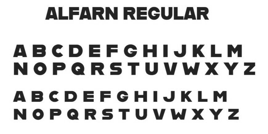
For my typography I decided to go with Alfarn. Alfarn is bold, and is unique. I think this typeface compliments the design.
Digital Iterations
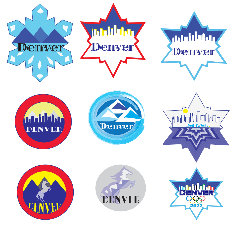
I created 9 digital sketches from feedback with a variety of color schemes to help showcase Denver, winter and the well known mountains.
Final Design
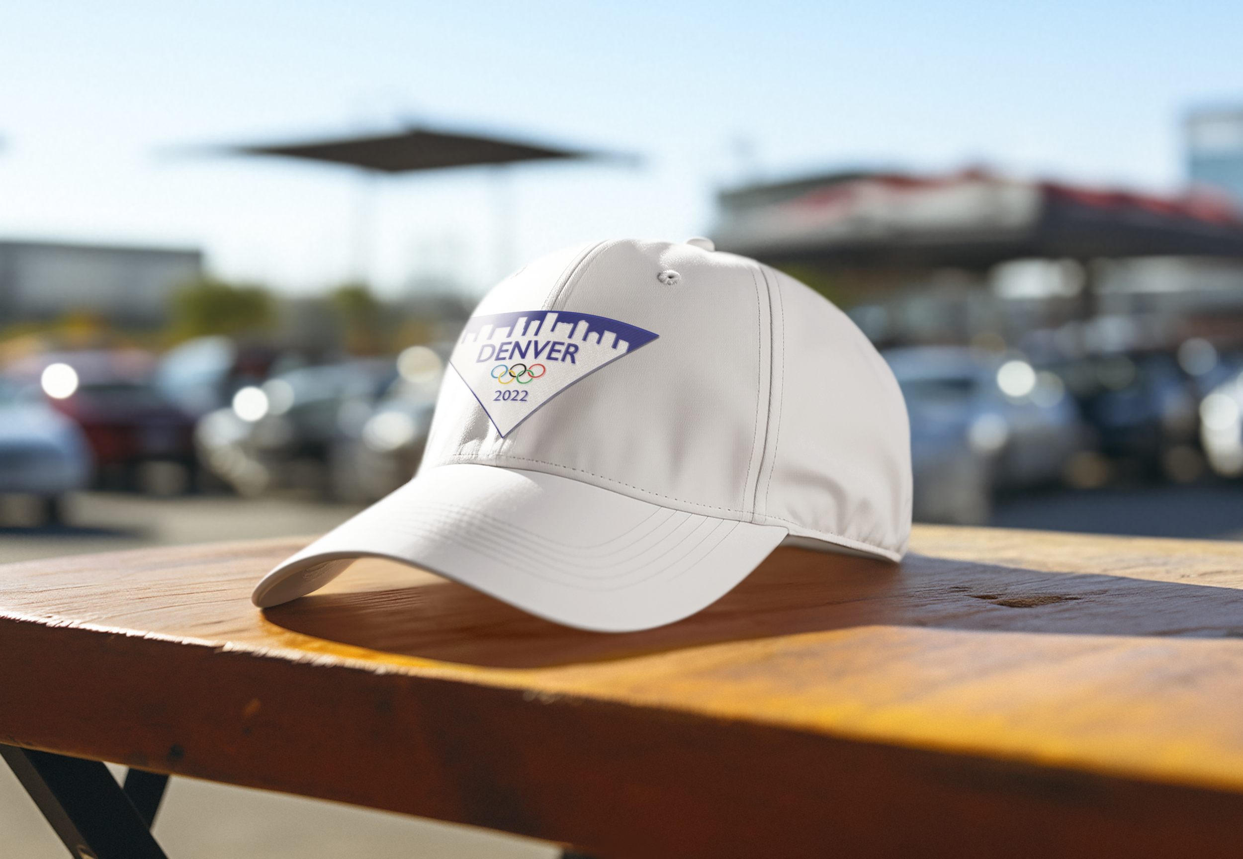
After feedback, I was able to create a simple and clean design that help represents Denver with the cool tones to showcase the winter theme.
Pictograms
For the pictograms, I wanted to showcase the shapes of the mountains and connect them to each other by utilizing the same color tones being used in the logo.
Tickets
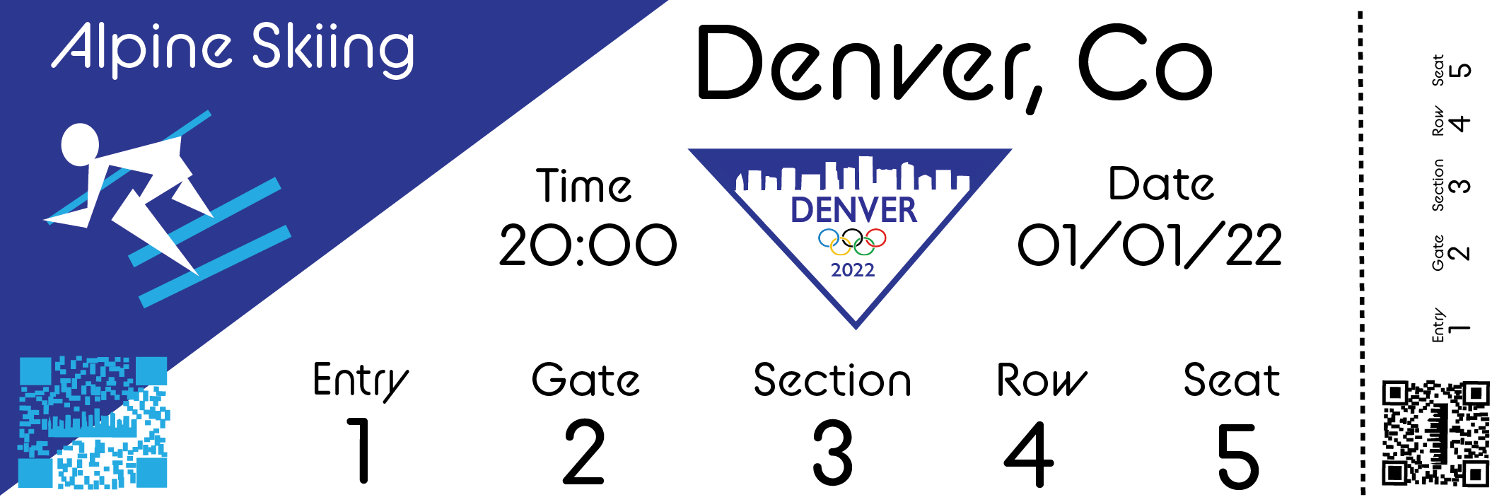
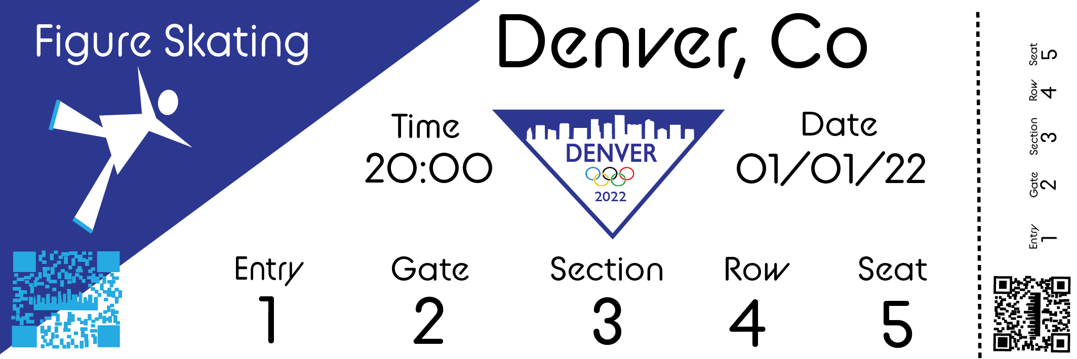
For the tickets, I wanted to keep the design consistent with the logo and pictograms. I used the same color cool tones and shapes representing the mountains.
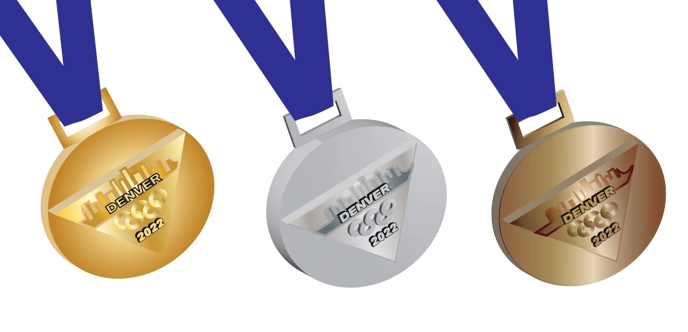
Medals
Environmental Contact
